![Rust Grove Farms_Logo Development_Finals [Recovered]-16.jpg](https://images.squarespace-cdn.com/content/v1/5c27e3feb98a7869da3c9574/1740343724200-3PYJKCBB03USYJ4UHAS3/Rust+Grove+Farms_Logo+Development_Finals+%5BRecovered%5D-16.jpg)
![Rust Grove Farms_Logo Development_Finals [Recovered]-15.jpg](https://images.squarespace-cdn.com/content/v1/5c27e3feb98a7869da3c9574/1740343767643-F3GQBKPG19RBFHD5VM5J/Rust+Grove+Farms_Logo+Development_Finals+%5BRecovered%5D-15.jpg)
![Rust Grove Farms_Logo Development_Finals [Recovered]-17.jpg](https://images.squarespace-cdn.com/content/v1/5c27e3feb98a7869da3c9574/1740343716959-RHVKIETVO35DAV1ZAEJE/Rust+Grove+Farms_Logo+Development_Finals+%5BRecovered%5D-17.jpg)
Branding a Legacy
For over 150 years, this special piece of land nestled in Kalamazoo’s western-most fields has been a part of history. Starting as grape vineyards and a cattle farm, turning to watermelon fields and pine tree woodlots, it eventually transitioned to a horse farm. Over time, the land was divided among new families, each giving it their own unique shape and purpose. When the time came for the unofficially named “Sandy Pines Ranch” to begin its next chapter, the owner, seeing the passion for horses we both shared, reached out to me with an offer to purchase the property and continue its legacy. Without hesitation, I said yes!
Transforming this private, backyard barn into a small business and branded LLC has been both an honor and a heartfelt journey. I cherish the deep, rich history that’s woven into this land. With every step, I believe something truly special has been created —an all-encompassing name and brand that will do justice to the farm and all those who’ve helped shape it.

![Rust Grove Farms_Logo Development_Finals [Recovered]-23.jpg](https://images.squarespace-cdn.com/content/v1/5c27e3feb98a7869da3c9574/1740345677780-IWIQU5RGPQSFL0XD5JU5/Rust+Grove+Farms_Logo+Development_Finals+%5BRecovered%5D-23.jpg)
![Rust Grove Farms_Logo Development_Finals [Recovered]-21.jpg](https://images.squarespace-cdn.com/content/v1/5c27e3feb98a7869da3c9574/1740345709484-3X5X15UCJXRC3SNK6RL6/Rust+Grove+Farms_Logo+Development_Finals+%5BRecovered%5D-21.jpg)
![Rust Grove Farms_Logo Development_Finals [Recovered]-22.jpg](https://images.squarespace-cdn.com/content/v1/5c27e3feb98a7869da3c9574/1740345723880-XS92ZWN3W6CST1KG33UQ/Rust+Grove+Farms_Logo+Development_Finals+%5BRecovered%5D-22.jpg)
![Rust Grove Farms_Logo Development_Finals [Recovered]-19.jpg](https://images.squarespace-cdn.com/content/v1/5c27e3feb98a7869da3c9574/1740345791564-51TXVMC7KVBTE0JL5OVL/Rust+Grove+Farms_Logo+Development_Finals+%5BRecovered%5D-19.jpg)
![Rust Grove Farms_Logo Development_Finals [Recovered]-20.jpg](https://images.squarespace-cdn.com/content/v1/5c27e3feb98a7869da3c9574/1740345799953-WELN4U1PFJYE531I8UHA/Rust+Grove+Farms_Logo+Development_Finals+%5BRecovered%5D-20.jpg)
Timeless Inspiration
Rooted in history, memories, and stories, I wanted the brand to capture a timeless and classic essence. As I explored countless design styles during the ideation process, I couldn’t shake the images of old picture books and hand-drawn illustrations. When I came across a few inspiring examples, it clicked—I knew we were onto something special.
Pairing an illustration with type may be a bit of a n0-no in today’s modern, digital world, but it felt right for “The Farm.” The property isn’t just rich in history; it exudes a sense of calm, peace, and comfort, almost like a warm hug that envelops you when you’re there. I wanted the mark to reflect that—both historic and welcoming.
These early examples captured the vibe I envisioned and guided me as I designed the final concept—timeless, rustic, and classic, all harmoniously coming together.


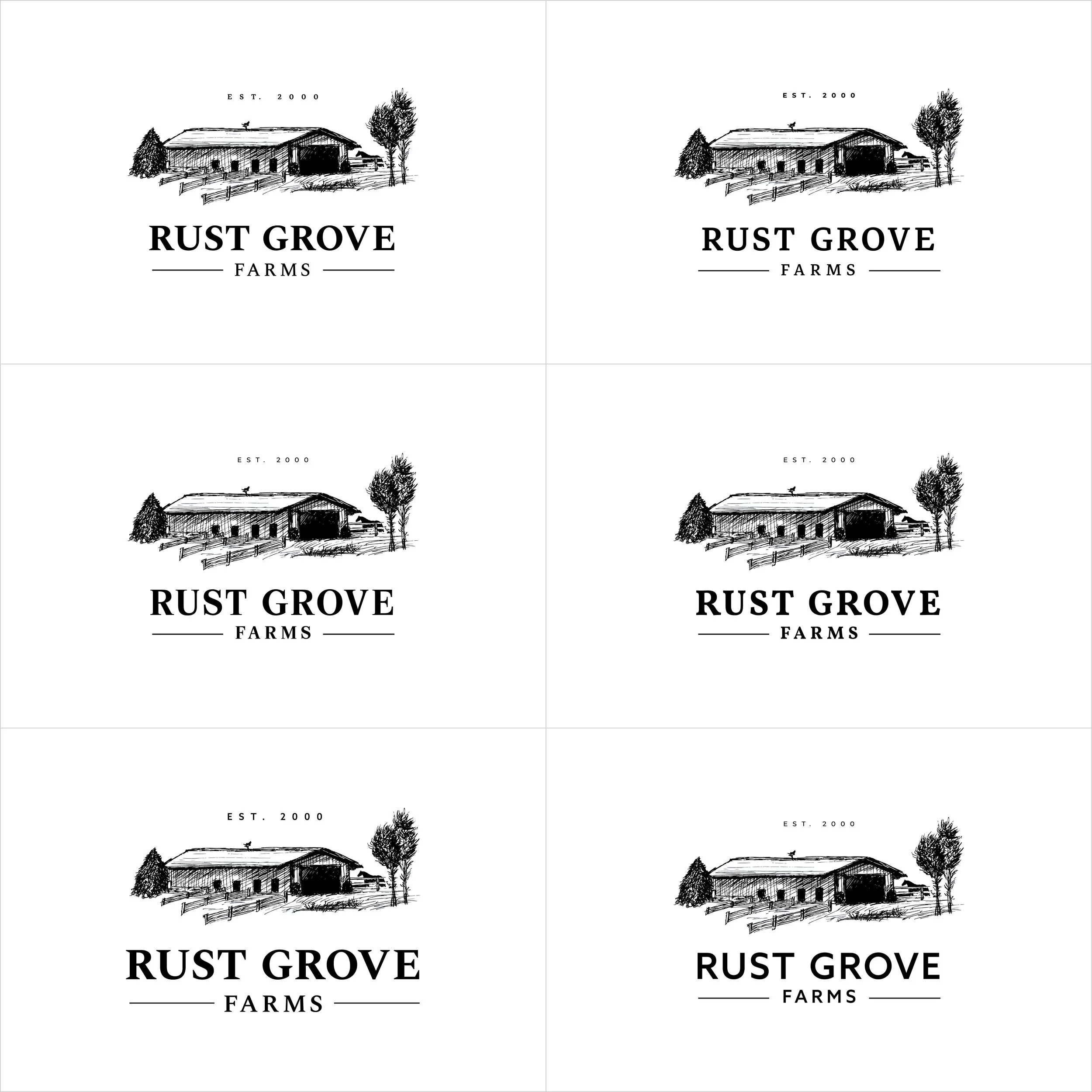
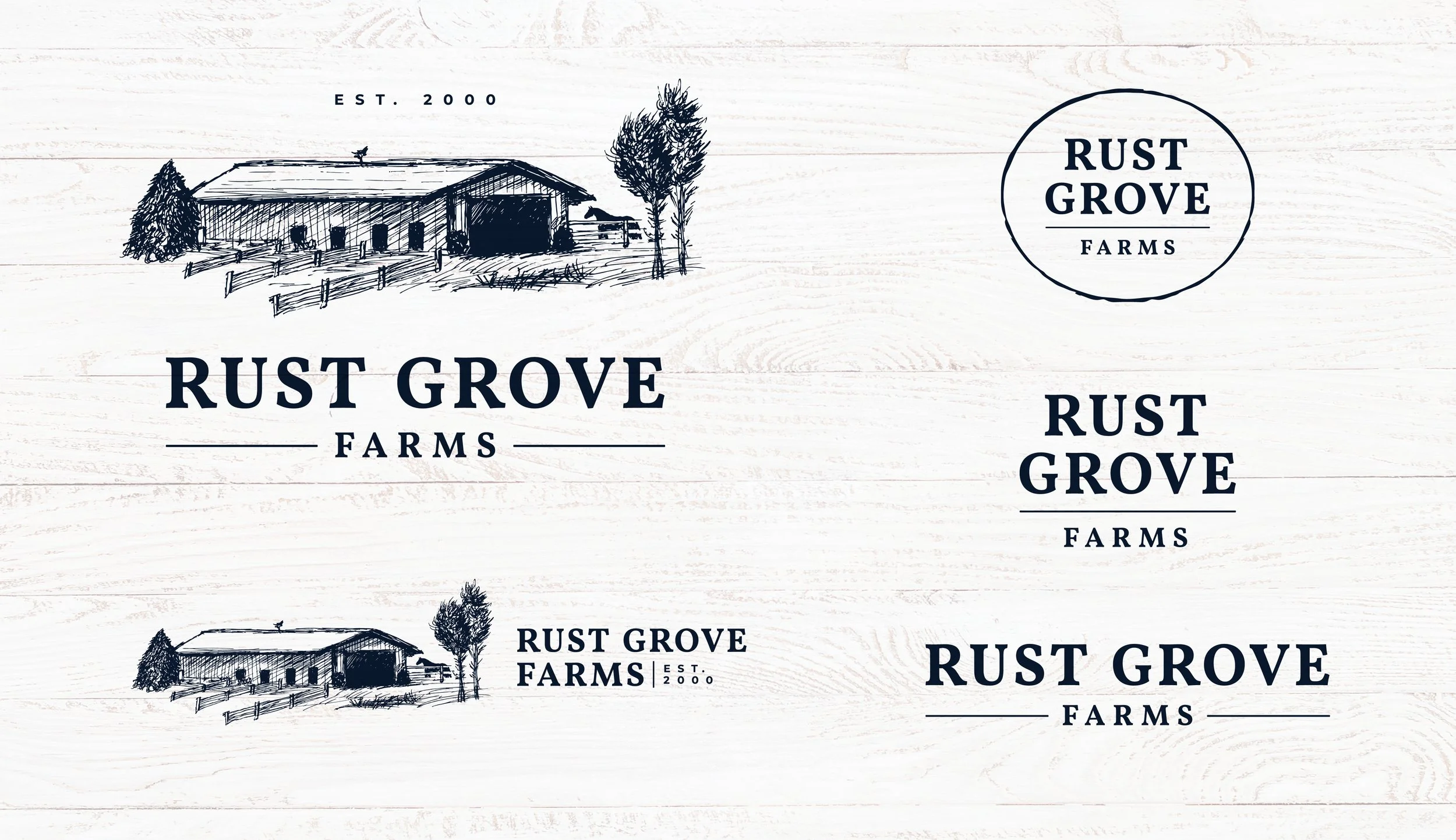
Evolution of the Logo
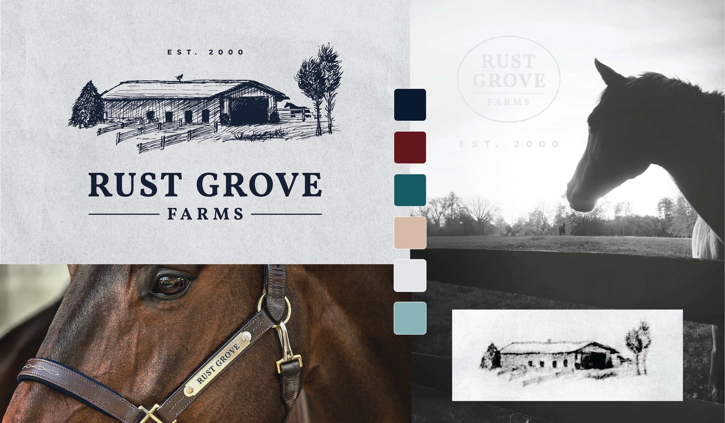
Naming the farm was the first big challenge. Words like "sandy," "pines," "peace," and anything horse-related felt too basic. I wanted something more meaningful. Given that the current owners, my husband, and I all share Dutch heritage, I turned to Dutch words for inspiration. That’s when I discovered “Rust” (or “Ruste”), which means "peace and tranquility," and it immediately felt right. The connection was clear: my heart horse, a beautiful rust-colored gelding; my husband, a vintage car enthusiast with a soft spot for rust and patina; and Giles Write, the original owner, who left behind a truck rusting down to its frame. We also unearthed rusty fence posts buried on the grounds, further cementing the theme. Pairing "Rust" with "Grove" felt perfect, as the farm is nestled peacefully between pine woodlots and grand oak trees.
As an established portrait artist, drawing the barn I had grown to love was both exciting and daunting. I wanted to capture its essence but had to strike a balance between detail and simplicity. Anything too detailed would be difficult to print, while something too flat or digital felt uninspired. After six months of deliberation, the right idea finally clicked. Since the angle I envisioned couldn’t be captured in a photo—buried as it was in trees—I relied on the view I had ingrained in my mind. The final design, with its hatching style, references old hand-drawn illustrations yet maintains the simplicity needed for modern printing.
The next challenge was pairing it with the right typeface. I wanted something timeless, but not dated or jagged like many classic serifs. After much searching, I found the perfect fit—Vollkorn SC, a softer serif that added a classic feel with a modern, gentle touch.
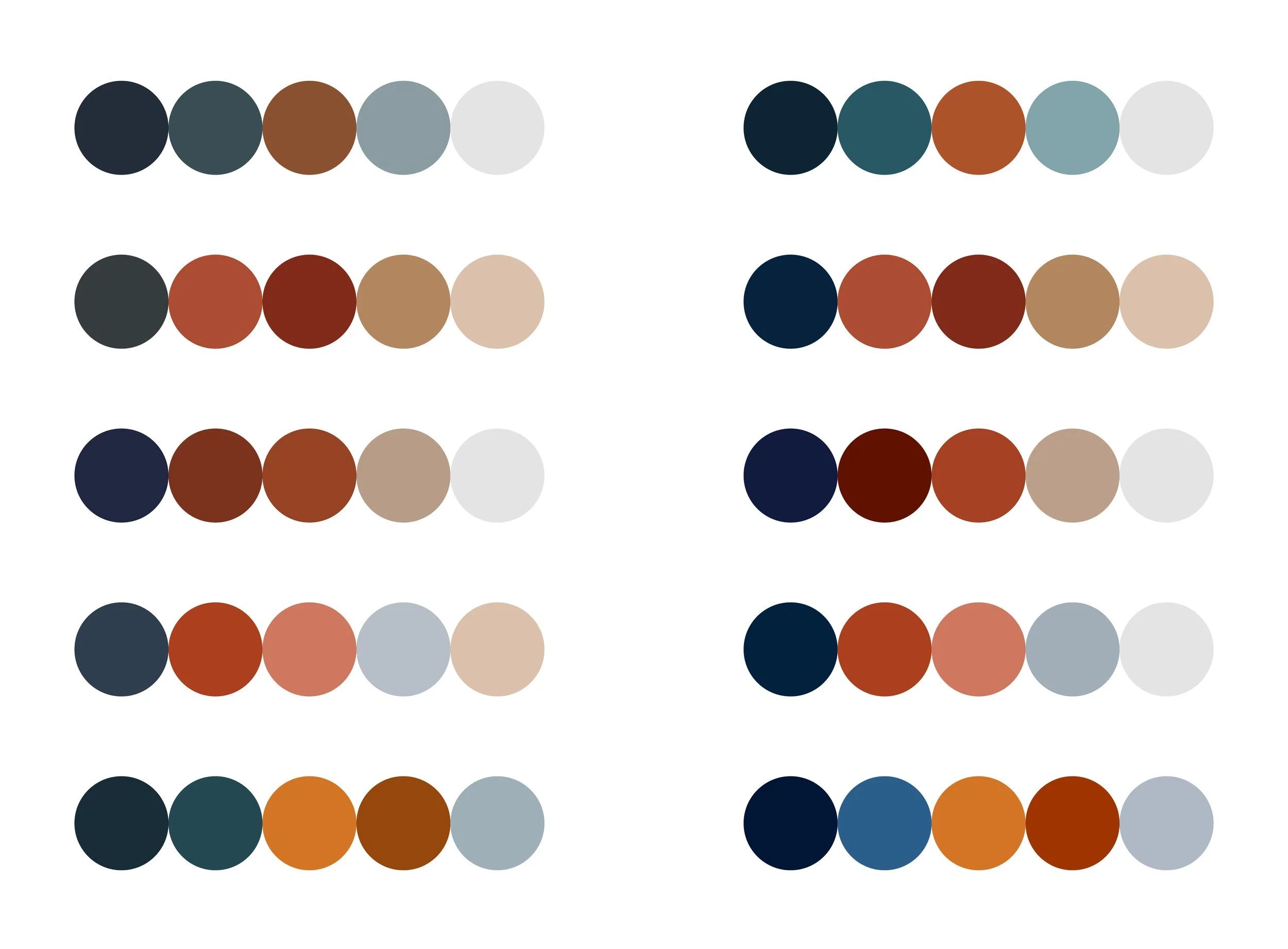
An Aged Color Palette
The color palette mirrors the timeless, classic feel of the logo. The barn has always been blue, a color cherished by the current owners, making navy an obvious primary choice. A rust tone followed, paying tribute to the farm’s name and history. Welcoming, muted secondary tones reflect the patina of aged metal while evoking a sense of calm and nostalgia. To further echo vintage printing methods, the palette remains slightly subdued. Finally, soft greys and tans were added, inspired by aged parchment and the sandy soil beneath the farm.


A True Passion Project
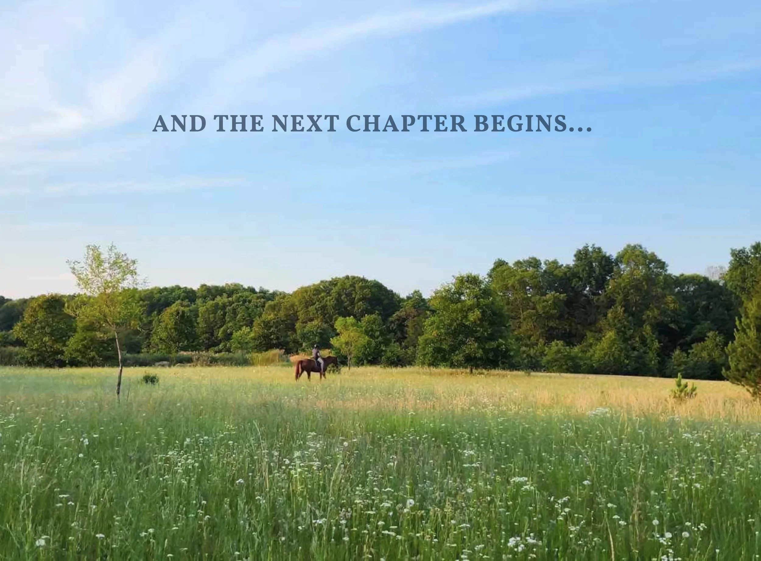
This farm is more than just a business—it’s a reflection of my lifelong love for horses and the deep connection I feel to this land. Every day brings new challenges, from maintaining the property to refining the vision, but that’s what makes it so rewarding. Just like the generations before me who shaped this space, I see this as an ever-evolving journey—one that requires dedication, care, and an open heart. As Rust Grove Farms continues to grow, my goal remains the same: to honor its history, nurture its future, and create a place where horses and people alike can thrive.

Digimate
Designing an eye-catching brand from start
to finish for a local orthopedic hand surgeon.