
![apogee_case study assets [Recovered]-02.png](https://images.squarespace-cdn.com/content/v1/5c27e3feb98a7869da3c9574/1742351547111-JYHYU2NKELT7LZBE8XD8/apogee_case+study+assets+%5BRecovered%5D-02.png)
![apogee_case study assets [Recovered]-04.png](https://images.squarespace-cdn.com/content/v1/5c27e3feb98a7869da3c9574/1742351547173-F5HI6PQQDTUXGU4U0GJC/apogee_case+study+assets+%5BRecovered%5D-04.png)
![apogee_case study assets [Recovered]-03.png](https://images.squarespace-cdn.com/content/v1/5c27e3feb98a7869da3c9574/1742351549201-HB2FH5SK59ARZ8E3QDAW/apogee_case+study+assets+%5BRecovered%5D-03.png)
Bigger Than Finance
A new client came to Tekna in search of a full brand identity for his strategic finance firm—an operation focused on delivering high-level financial solutions to large-scale companies in manufacturing, logistics, and production sectors. While several names were in consideration, the client was strongly drawn to Apogee, a term meaning “the highest point in the development of something.” It perfectly captured the level of expertise, precision, and strategic elevation he aimed to deliver to his clients.
With a name so aspirational, the design challenge was to create a visual identity that embodied both sophistication and momentum. I explored a wide range of symbolic directions—animals, abstract forms, letterforms, and monograms. After countless iterations, a breakthrough came late one night: a sleek monogram inspired by the infinity symbol. This mark subtly conveyed both enduring value and upward trajectory—ideals at the core of Apogee’s promise. The resulting logo and brand system became the cornerstone of a modern, confident identity that stands tall among its industry peers.
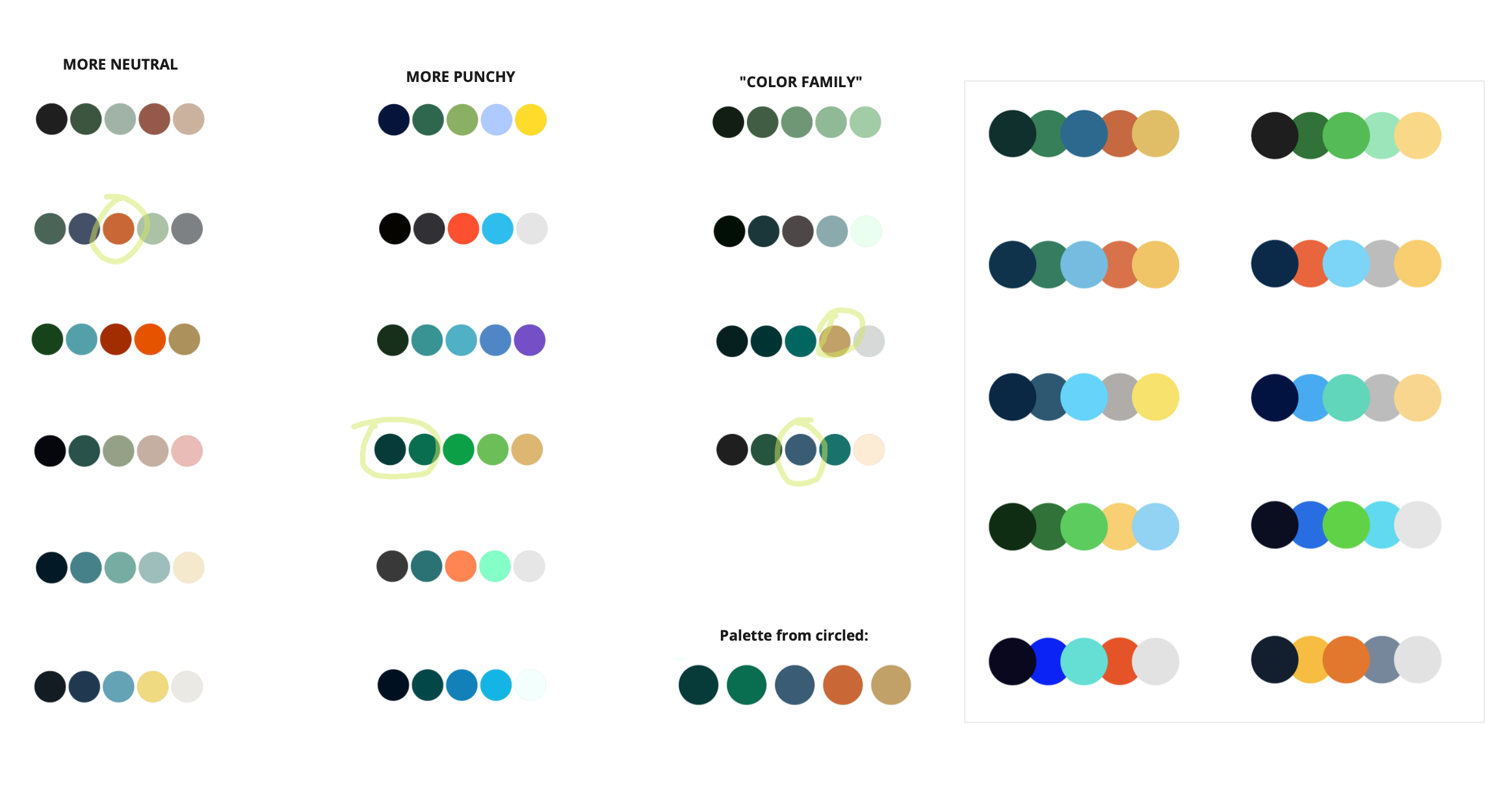
What Says, “Money?”
After finalizing a logo that conveyed longevity, expertise, and elevated skill, the next step was crafting a color palette to reinforce those qualities. I leaned into rich, masculine tones—deep navy and forest green—to evoke a sense of stability, trust, and professionalism. In collaboration with the client, we added a refined gold accent to subtly reflect themes of value, growth, and financial strength.
This modern yet timeless palette quickly became central to the Apogee identity, providing a strong visual foundation that could scale across a variety of brand expressions. With this cohesive look and feel, Apogee was poised to present itself as both credible and distinctive in a competitive market.


Divide and Conquer
With the brand foundation in place, we extended the Apogee identity across a wide range of touchpoints. I designed a polished pitch deck and presentation system that gave the client the tools to communicate confidently and clearly.
A custom landing page was created to establish an initial digital presence, supported by detailed brand standards and a set of bespoke icons that reinforced the brand’s refined personality. I also helped art direct a series of illustrations—brought to life by a talented colleague—that added warmth and visual storytelling to an otherwise complex, strategic space. Apparel and branded gear added an extra layer of cohesion, giving Apogee a strong, modern presence that’s as memorable as it is meaningful.


Paddle Pit
Hobby turned hero-project for my Senior Thesis. Creating a whole company
and branded collateral based on my love for paddling.