
I’m a Kayak Fan
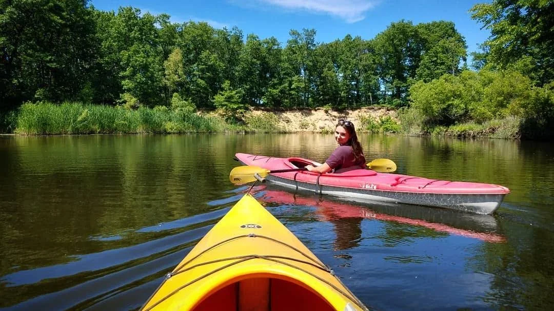
During my senior year at Michigan State University, our thesis project challenged us to build a brand from the ground up — name, logo, identity, and all. While horses felt like the natural choice, I wanted to explore something broader and more universally resonant. I turned to another lifelong love: kayaking. As a Michigander, I’ve always felt a strong connection to water. That final year of college was intense, and kayaking offered a peaceful escape. My now-husband and I would paddle out on inland lakes to catch sunsets and reset. Those quiet, golden evenings became the inspiration for a brand centered on simplicity, nature, and the restorative calm of the water.
The Creation of Paddle Pit
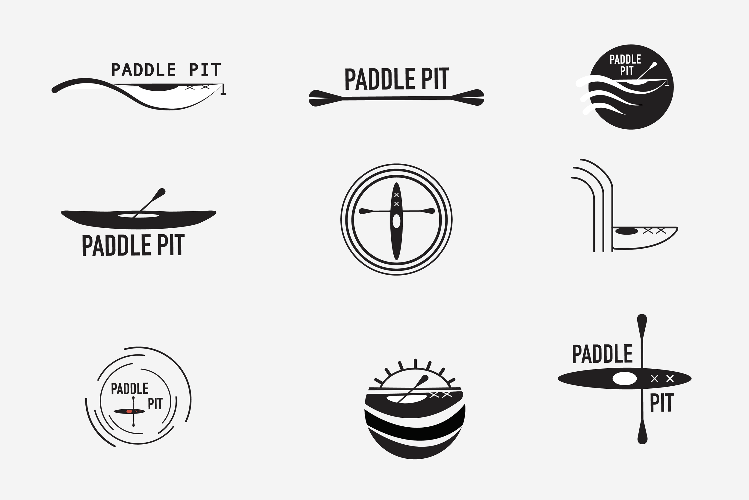

The name Paddle Pit came to me early in the process, inspired by a location I imagined at the base of Michigan’s Tahquamenon Falls. “Paddle” captured the kayaking spirit at the heart of the brand, while “Pit” hinted at its rugged, tucked-away setting below the falls. The name felt memorable, a little playful, and perfectly suited to the kind of adventure experience I wanted to create.
From there, the idea of Paddle Pit evolved into a full-fledged adventure company. Set in Michigan’s Upper Peninsula, it offers guided, multi-day paddling tours for nature lovers and adrenaline seekers alike. These trips are intentionally rugged and community-driven, giving paddlers a way to disconnect, explore, and connect with others on the water. The brand needed to reflect that sense of simplicity, challenge, and natural beauty—modern enough to stand out, but grounded in the timeless appeal of the outdoors.

Branded Collateral
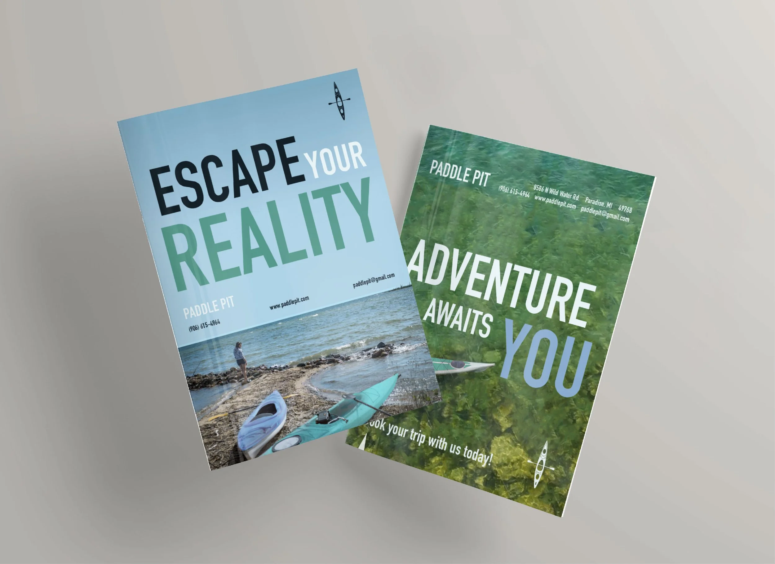
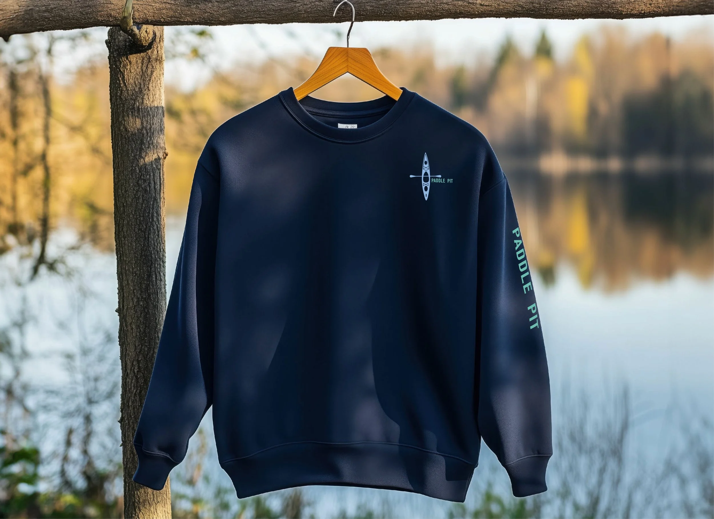
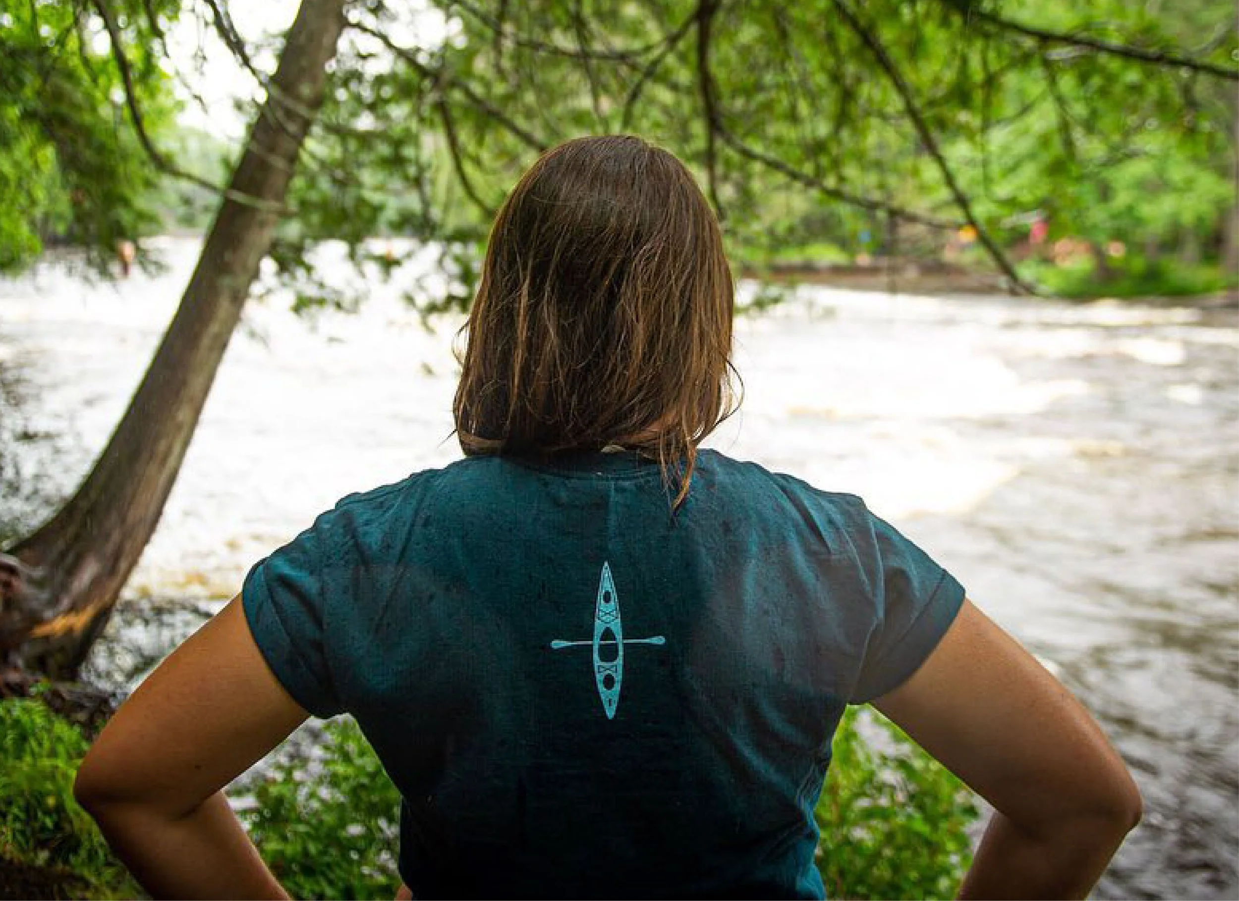
Coming up with a name and logo is just the beginning—any seasoned designer knows that a brand is a living, breathing entity that evolves over time and needs to be thoughtfully applied across every touchpoint. One of the most overlooked but important brand applications is mailing materials. Business cards, letterheads, and envelopes often shape a client’s first impression. To elevate these everyday items, I leaned into Paddle Pit’s modern aesthetic, using bold color-blocking to make even the simplest materials feel impactful and memorable.
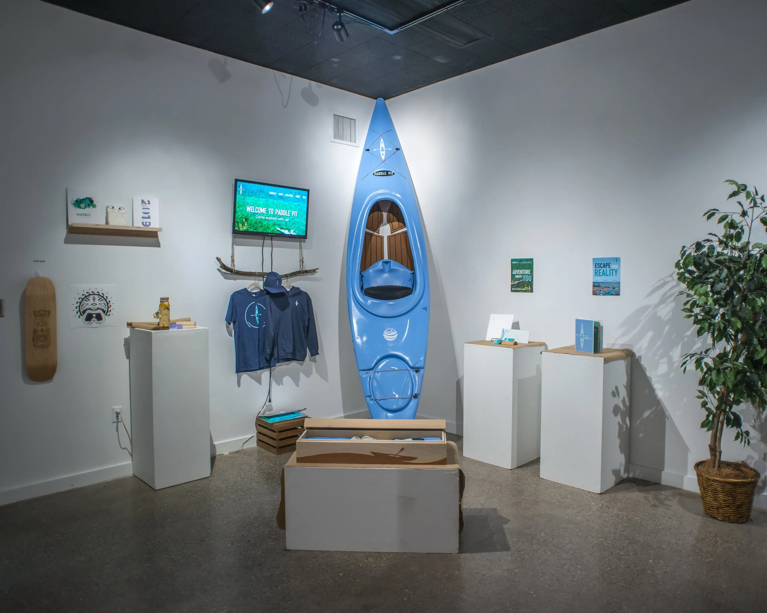
The brand continued to take shape through additional applications—clothing, stickers, a custom wooden Paddle Pit membership box, flyers, one-pagers, posters, and more. Though entirely fictional, the depth of the brand and the cohesive design system made it feel increasingly real, like a business ready to launch.


I Was Supposed to Design a Brochure. I Took That a Step Farther.
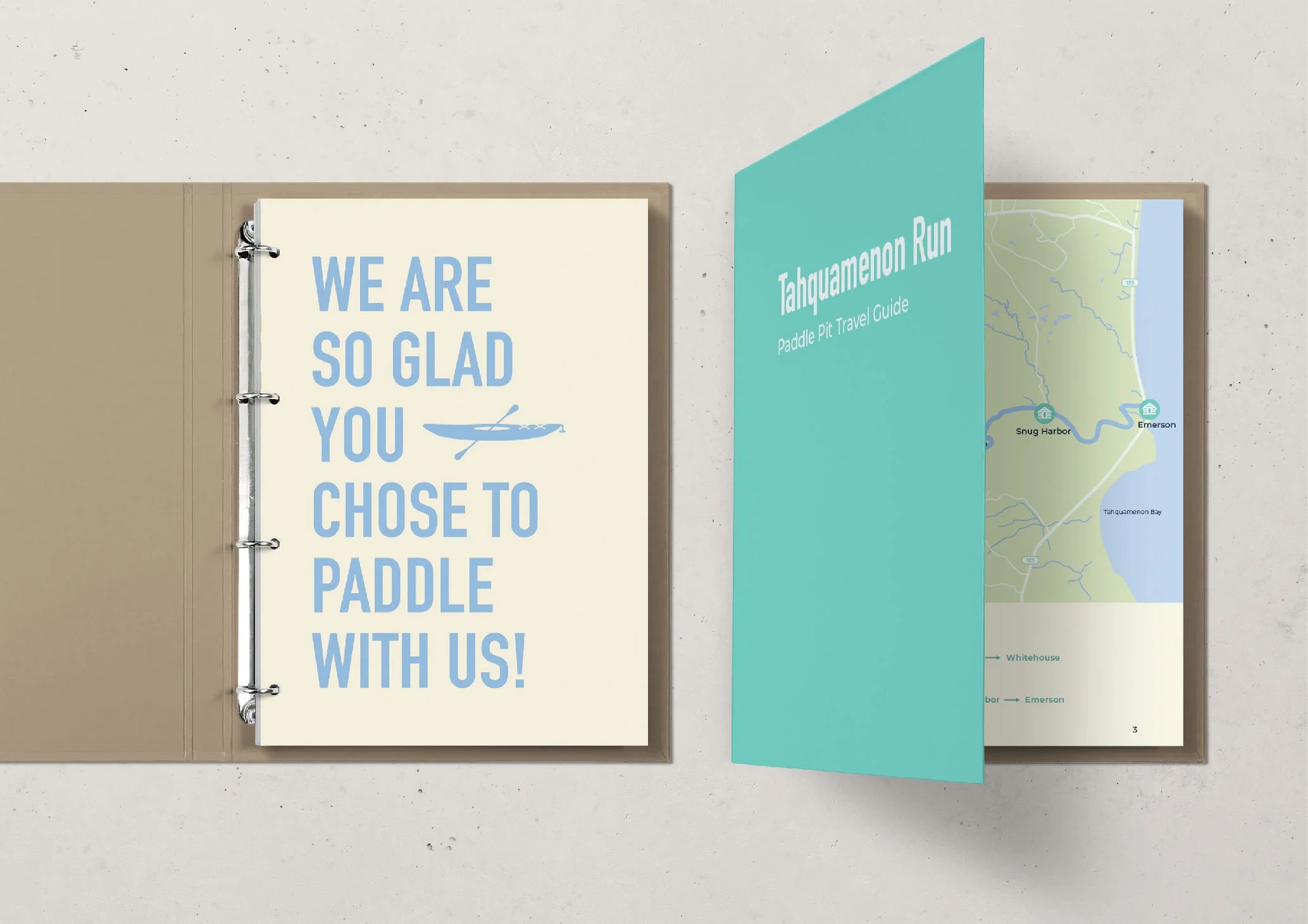
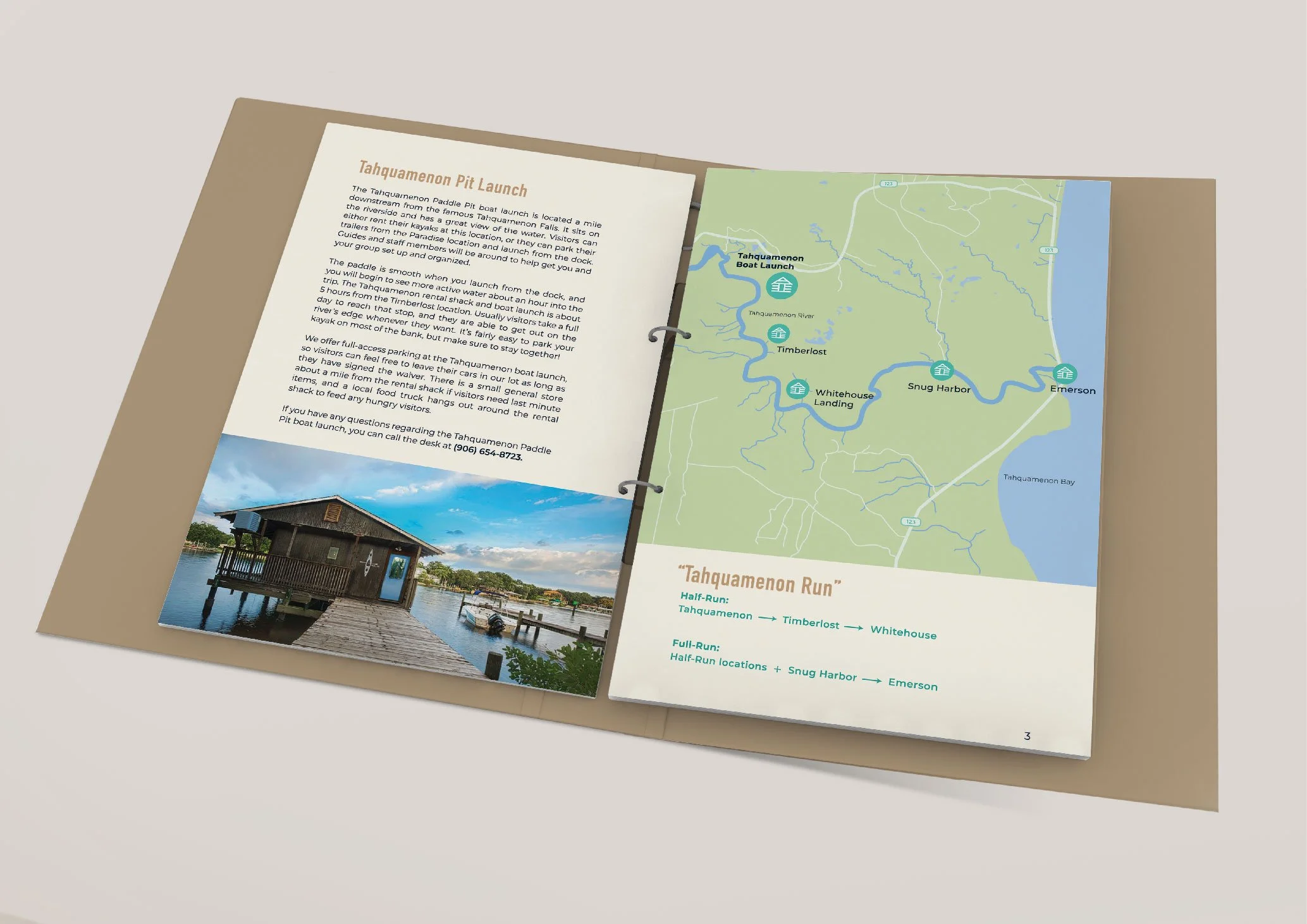
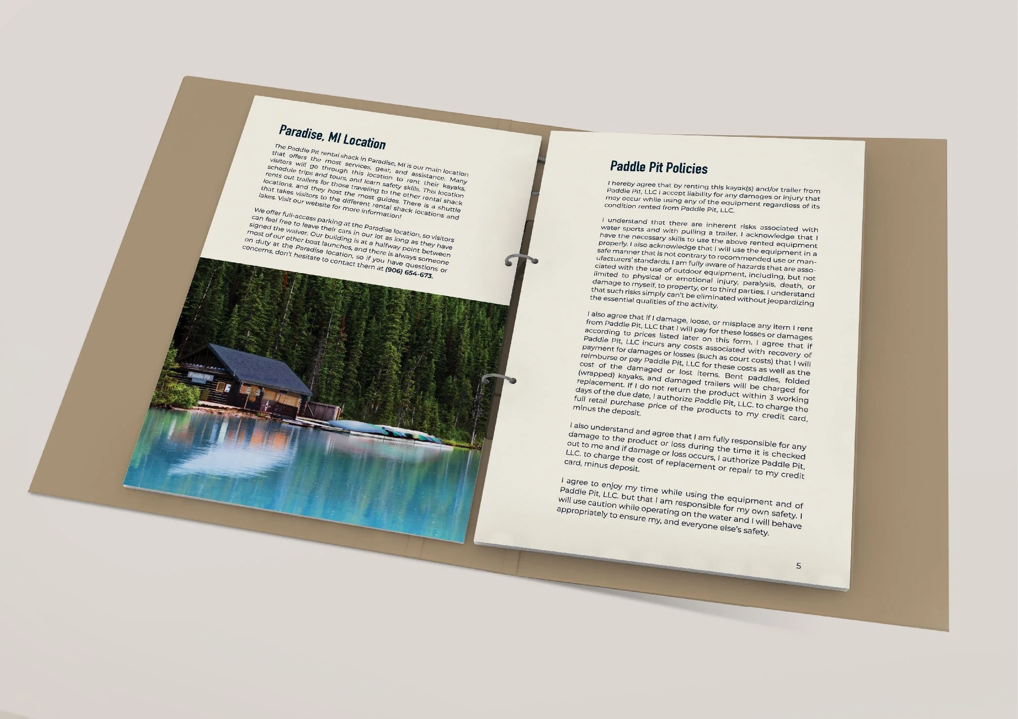
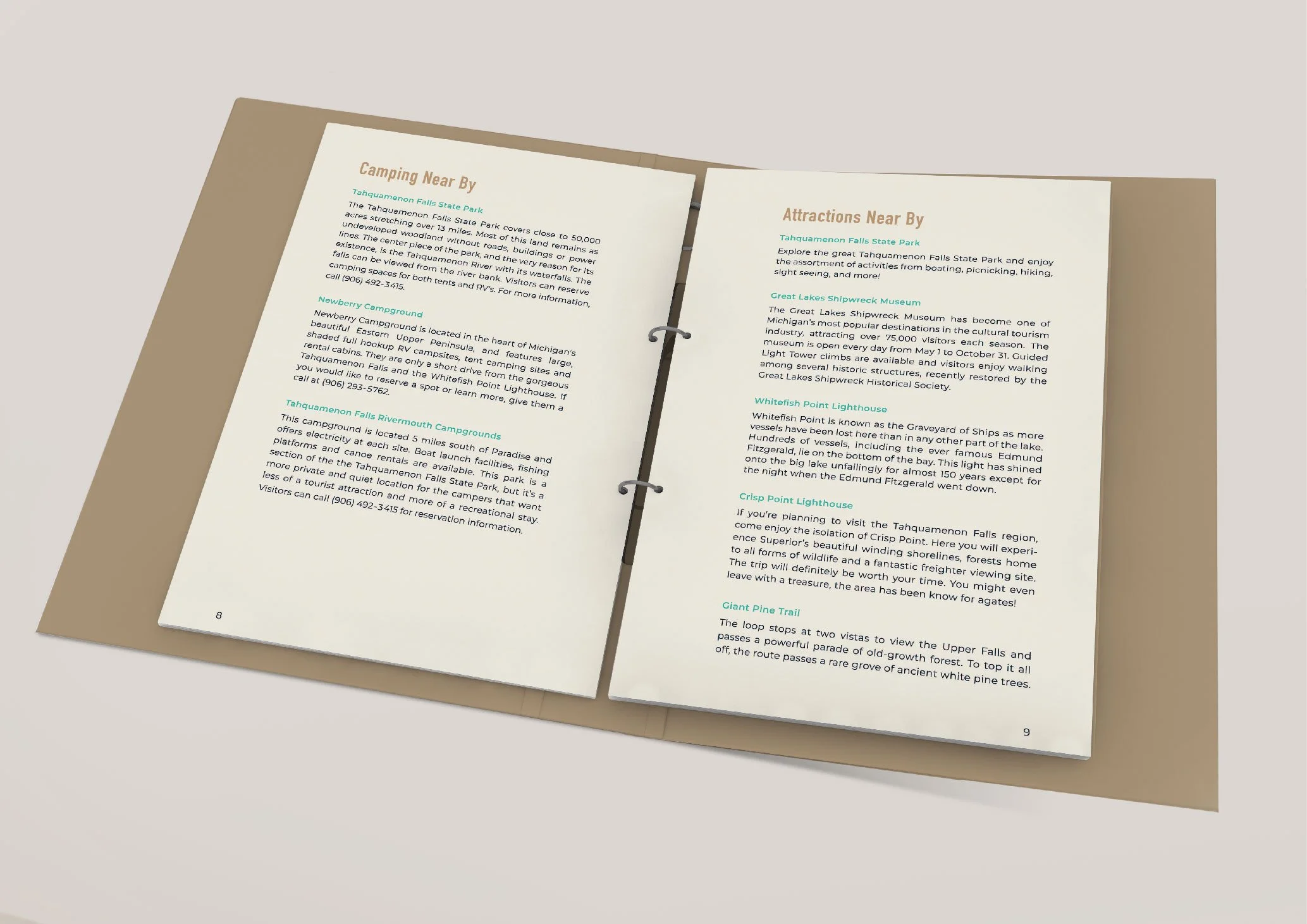
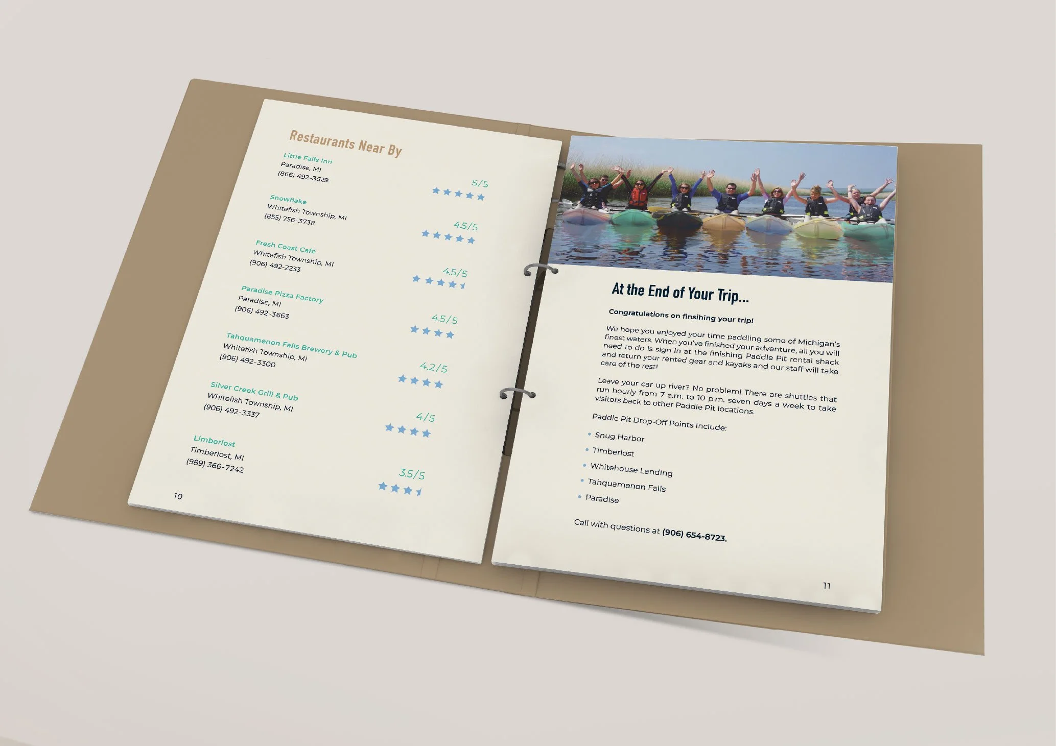
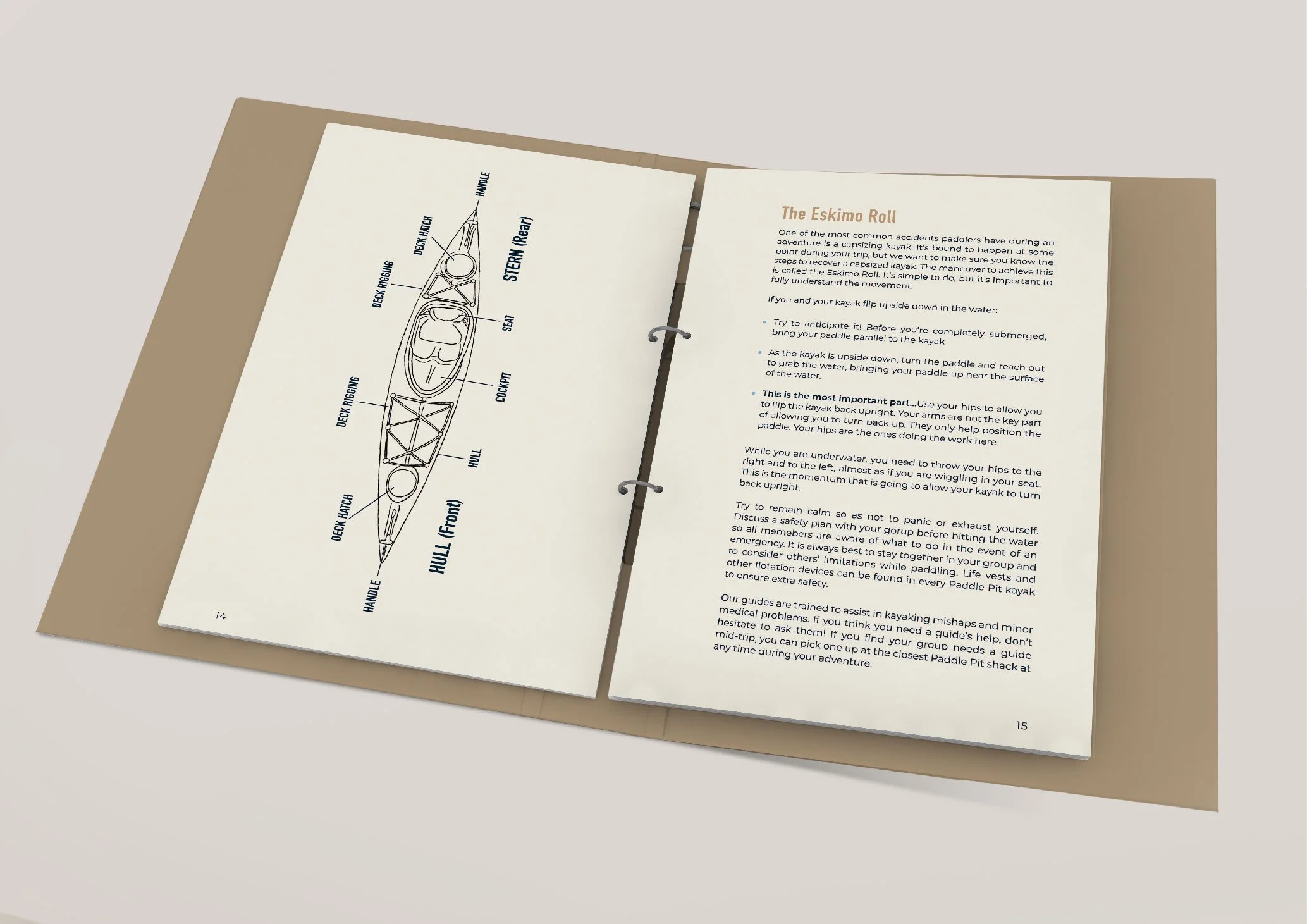
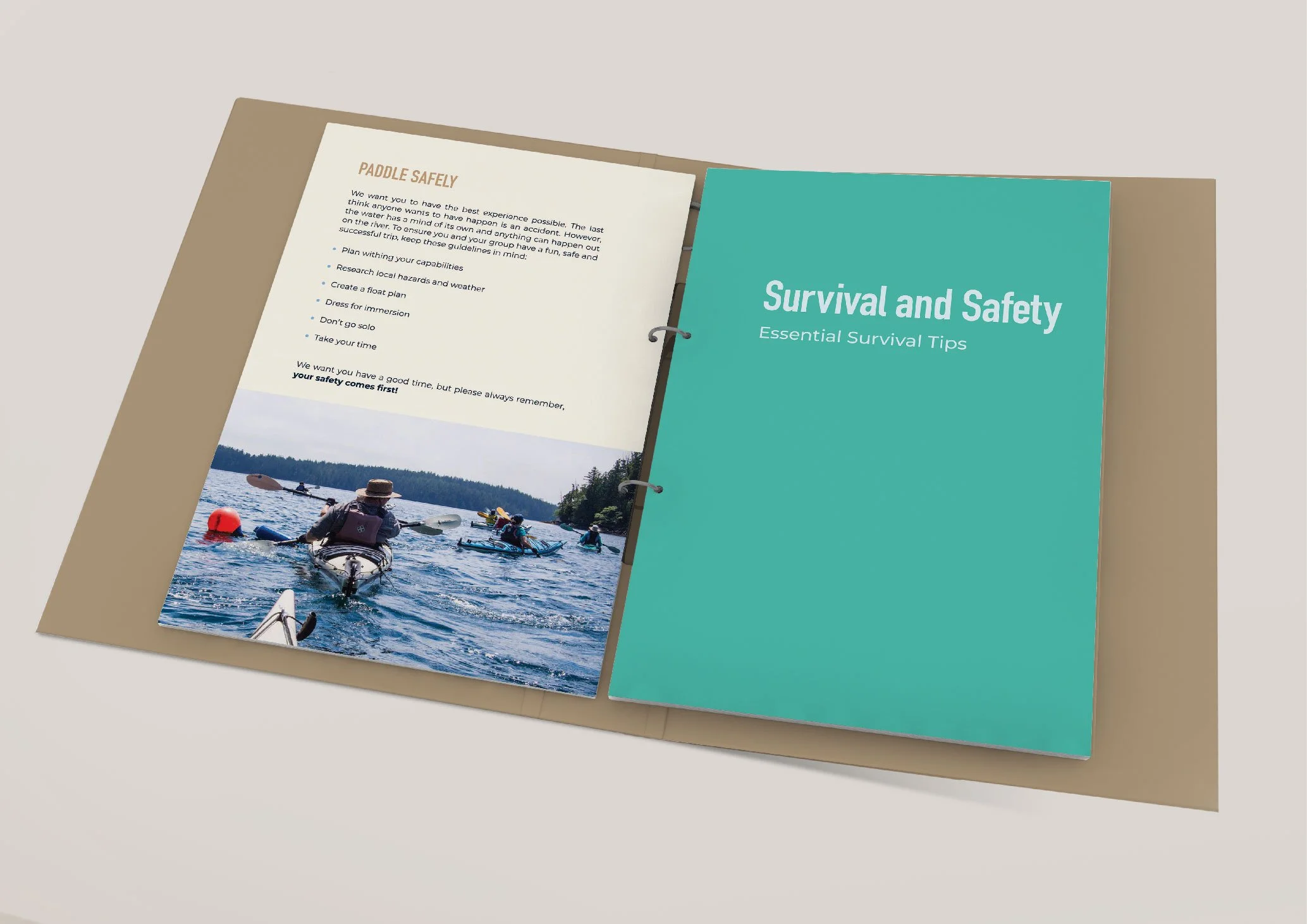
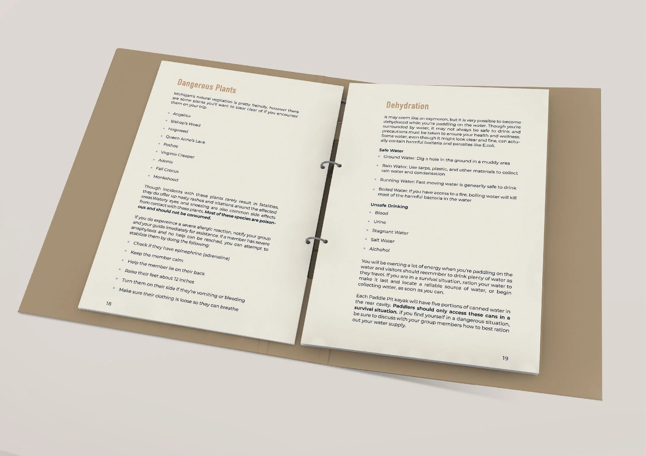
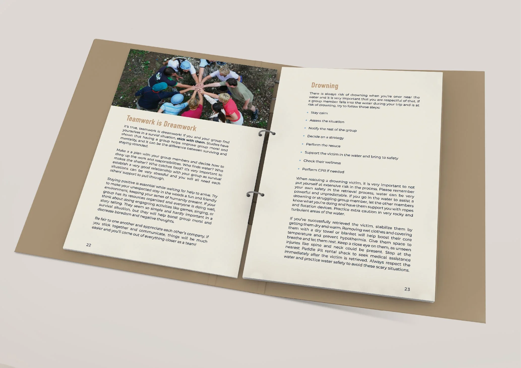
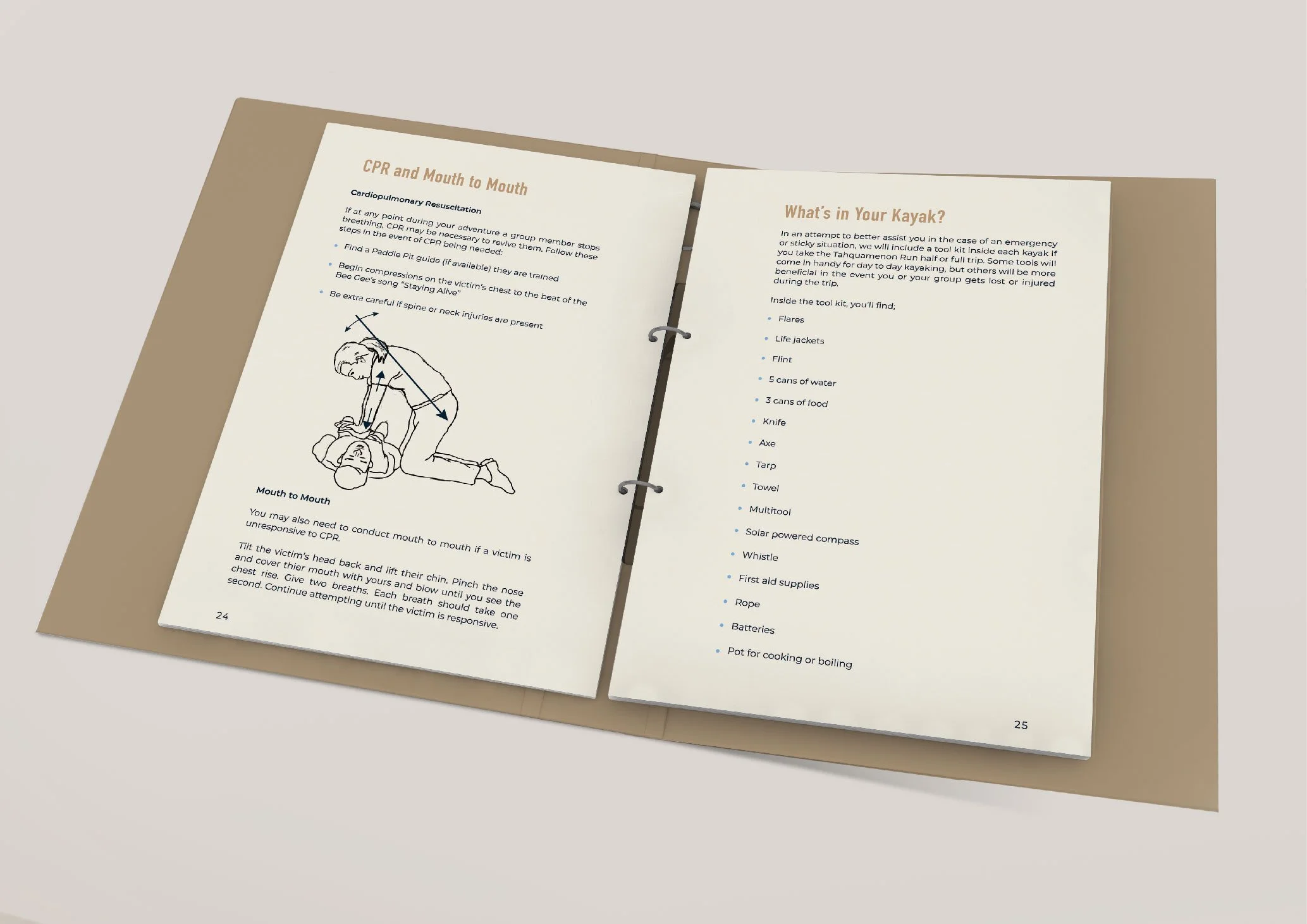
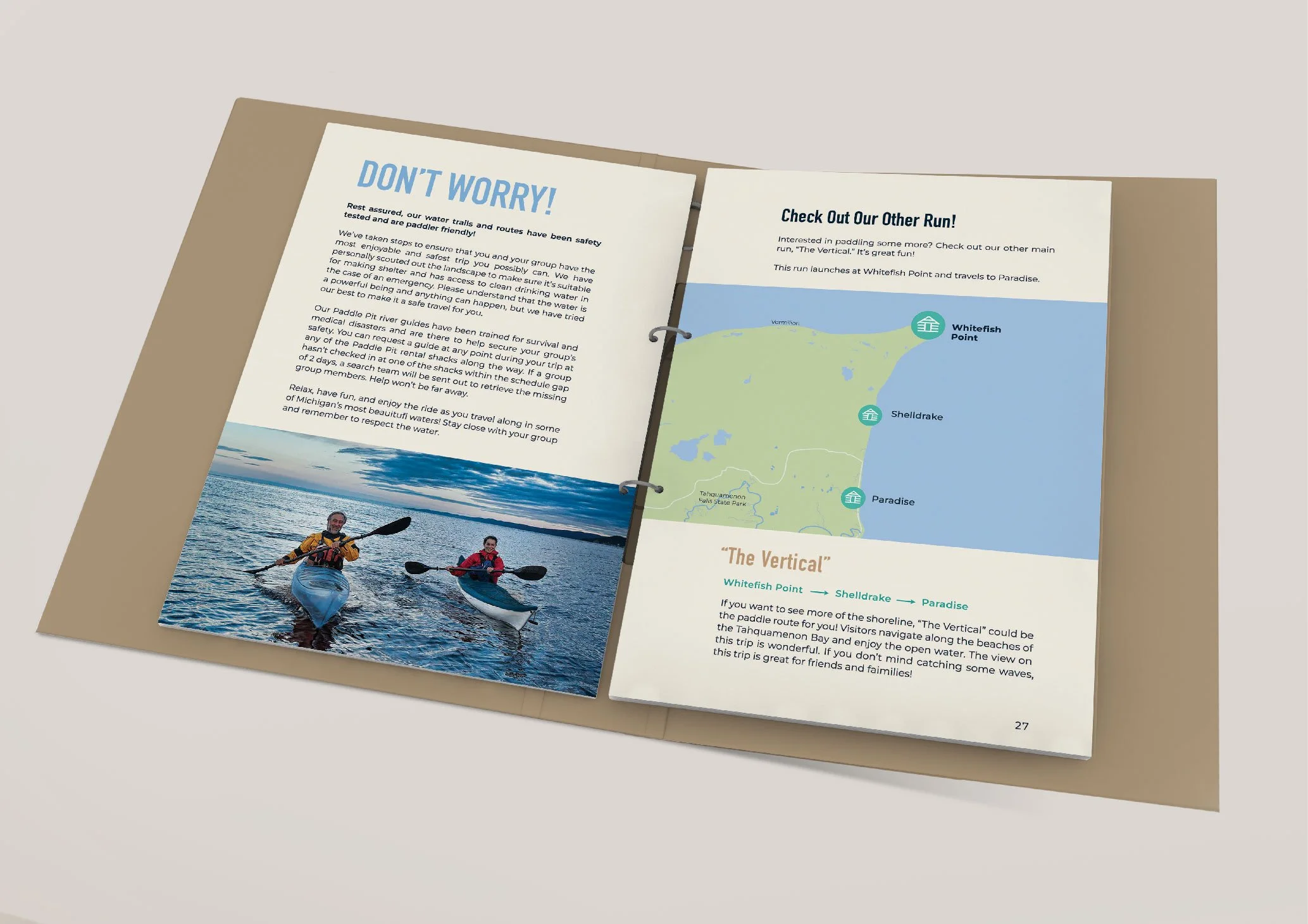
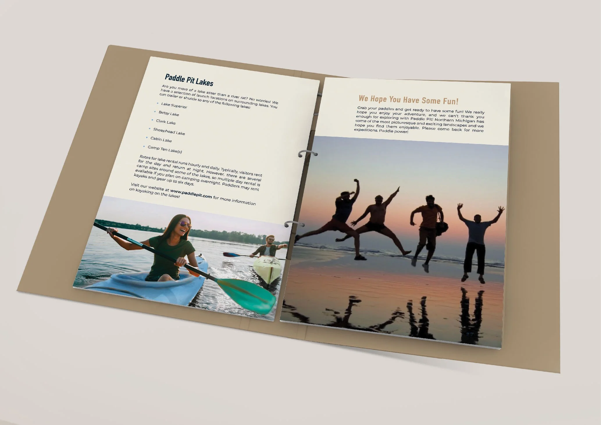
As part of the project, we were tasked with creating a printed piece to showcase our brand—menus, catalogs, or creative formats tailored to our individual concepts. For Paddle Pit, I designed a paddler’s guidebook centered around the flagship “Tahquamenon Run,” a multi-day kayak tour along the river with opportunities to camp en route. The guide included essential resources like route maps, emergency procedures, kayak anatomy, and alternative tour options. To bring even more realism to the brand, I printed the guide on waterproof paper—an authentic touch that made it feel truly usable, even in rugged conditions.

A Website So Real, I Wanted to Book a Trip
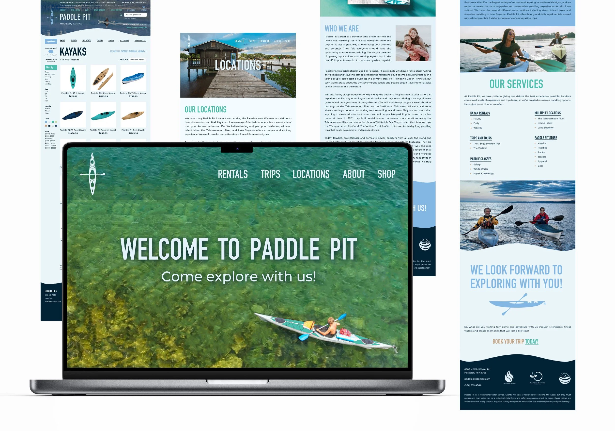
Creating a website wasn’t part of the original assignment, but it felt essential—how could a company like Paddle Pit exist without a place for adventurers to learn more and book their trips? I used my knowledge of web design tools to mock up a branded, engaging site that brought the company to life. It included key information about tours, the brand story, and how to book a trip, along with an online store where visitors could shop Paddle Pit merchandise and even design their own kayaks.
Creating a Real-Life Paddle Pit Kayak

Closing Out Undergrad with a Bang
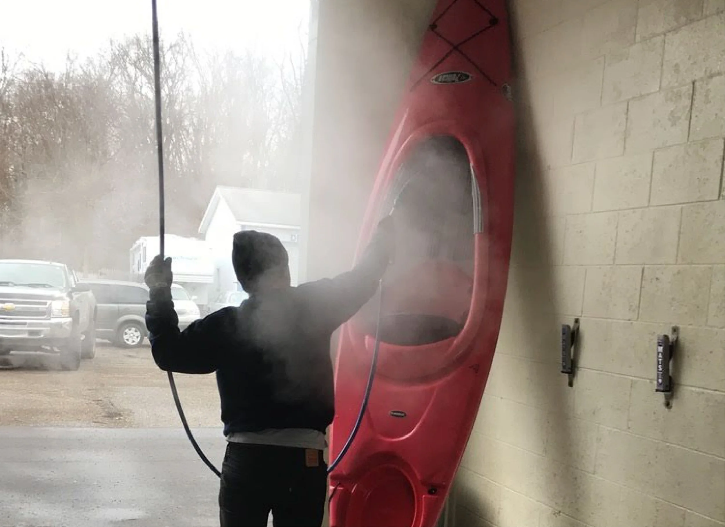
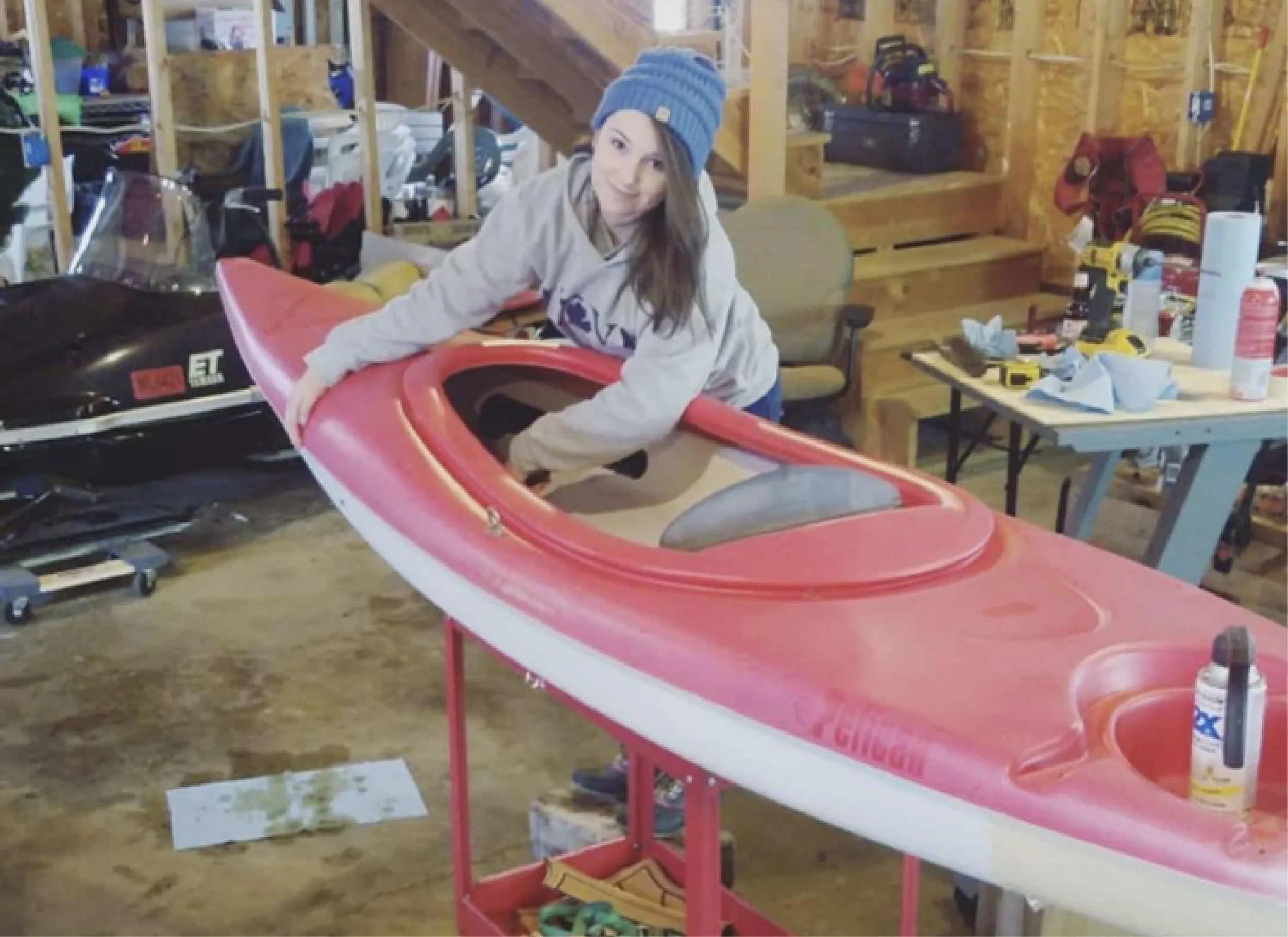
As senior year came to a close, my classmates and I prepared for our Senior Thesis exhibition, where we’d present our branded companies and portfolio work. To help bring Paddle Pit to life, my now-husband offered to repaint my little red kayak in the brand’s signature blue—turning it into a true statement piece for my booth. While I helped with the initial repaint, he took the lead so I could focus on finalizing the project and wrapping up coursework. The exhibition was a memorable experience, with the Paddle Pit-blue kayak catching visitors’ attention and drawing them into the space to explore the full range of branded materials.
Paddle Pit Wins a Gold ADDY
The pièce de résistance to cap off my senior year? Paddle Pit won an award!
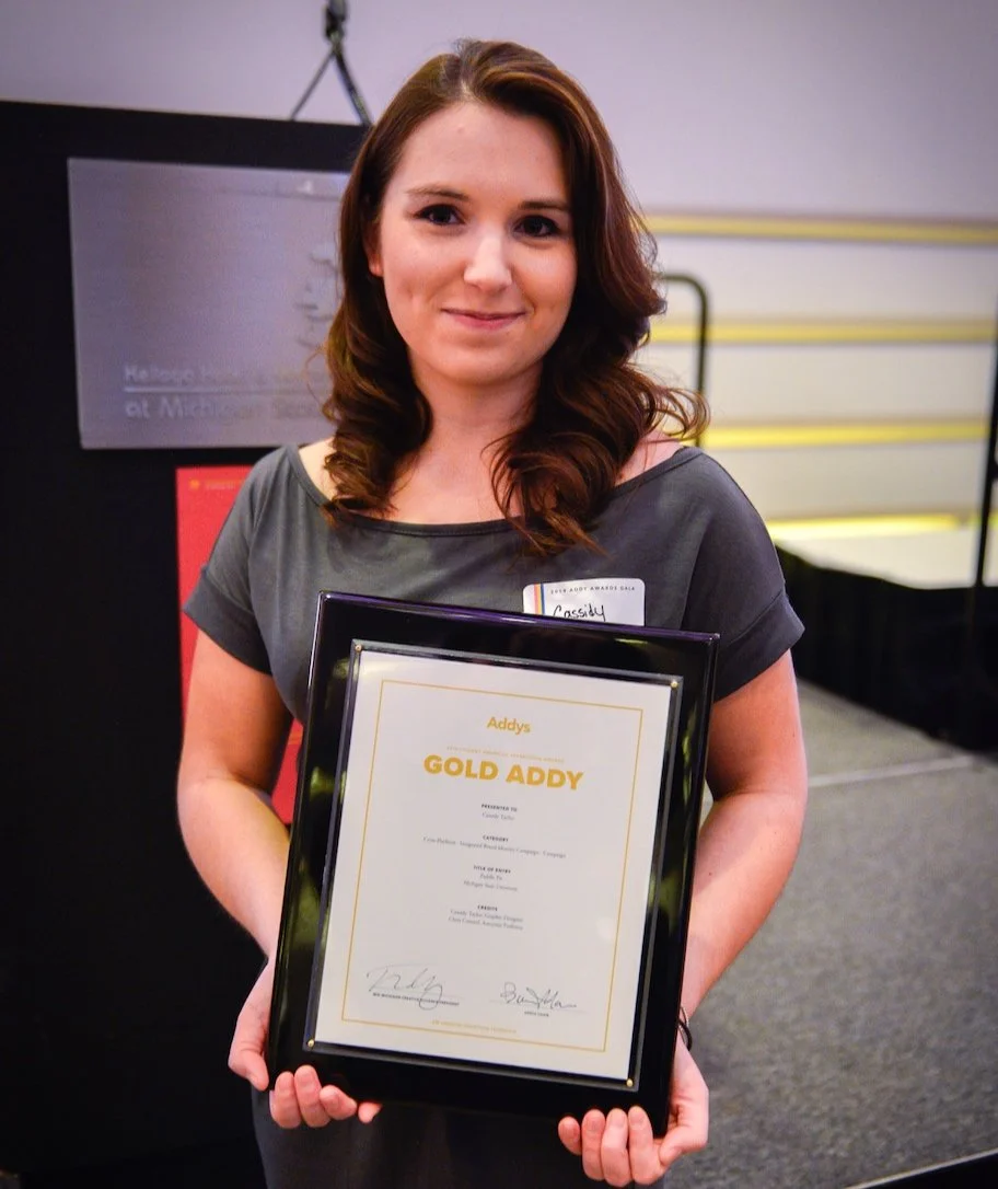
I submitted the project to the American Advertising Awards—commonly known as the ADDYs. This national competition, conducted annually by the American Advertising Federation (AAF), begins at the local level, where creative work is judged for excellence in advertising, branding, and design. Local winners advance to district competitions, and ultimately, the national stage. To my surprise and excitement, Paddle Pit was selected as a finalist and went on to win a Gold ADDY at the local level. From there, it advanced to the district competition, where it earned a Silver ADDY—a proud moment for a completely fictional brand that had taken on a life of its own!


Audrey
A girl and her horse – portraits on a beautiful Michigan summer night.